Customize the Design of Your Digital Menu

Table of Contents
In the Bestellmanagement Portal, you can refine the design of your Digital Menu. Play around with the settings and experiment to see which design fits your business best.
Overview
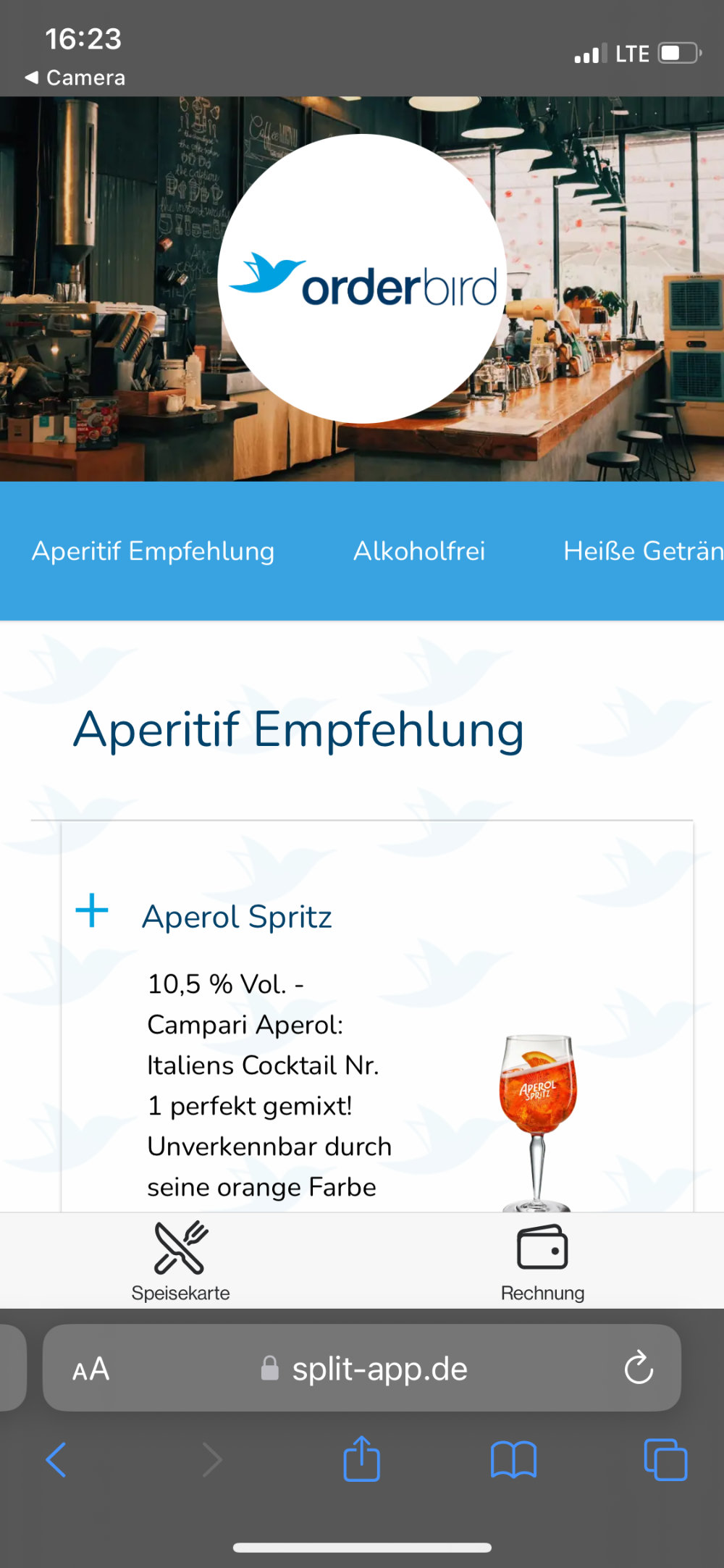
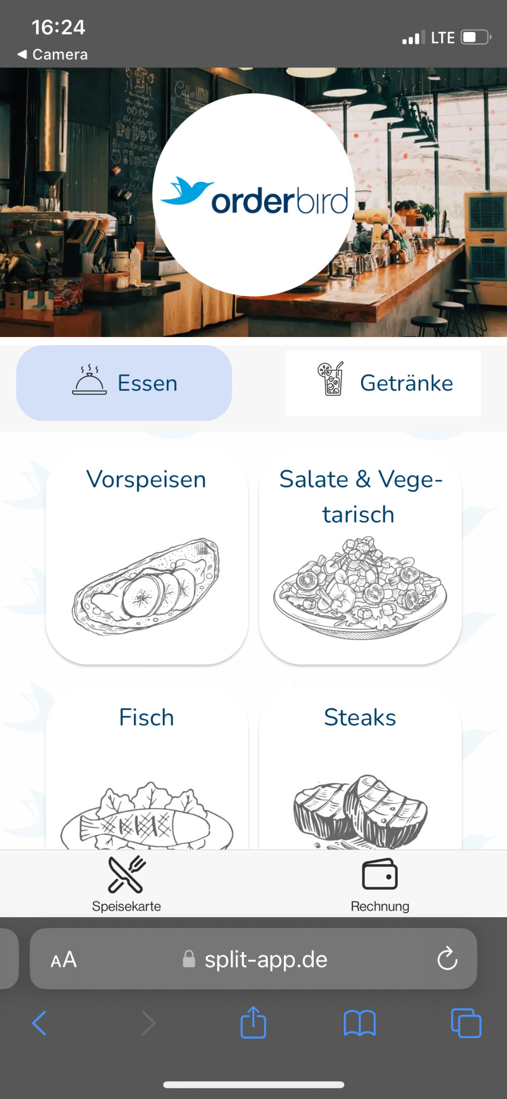
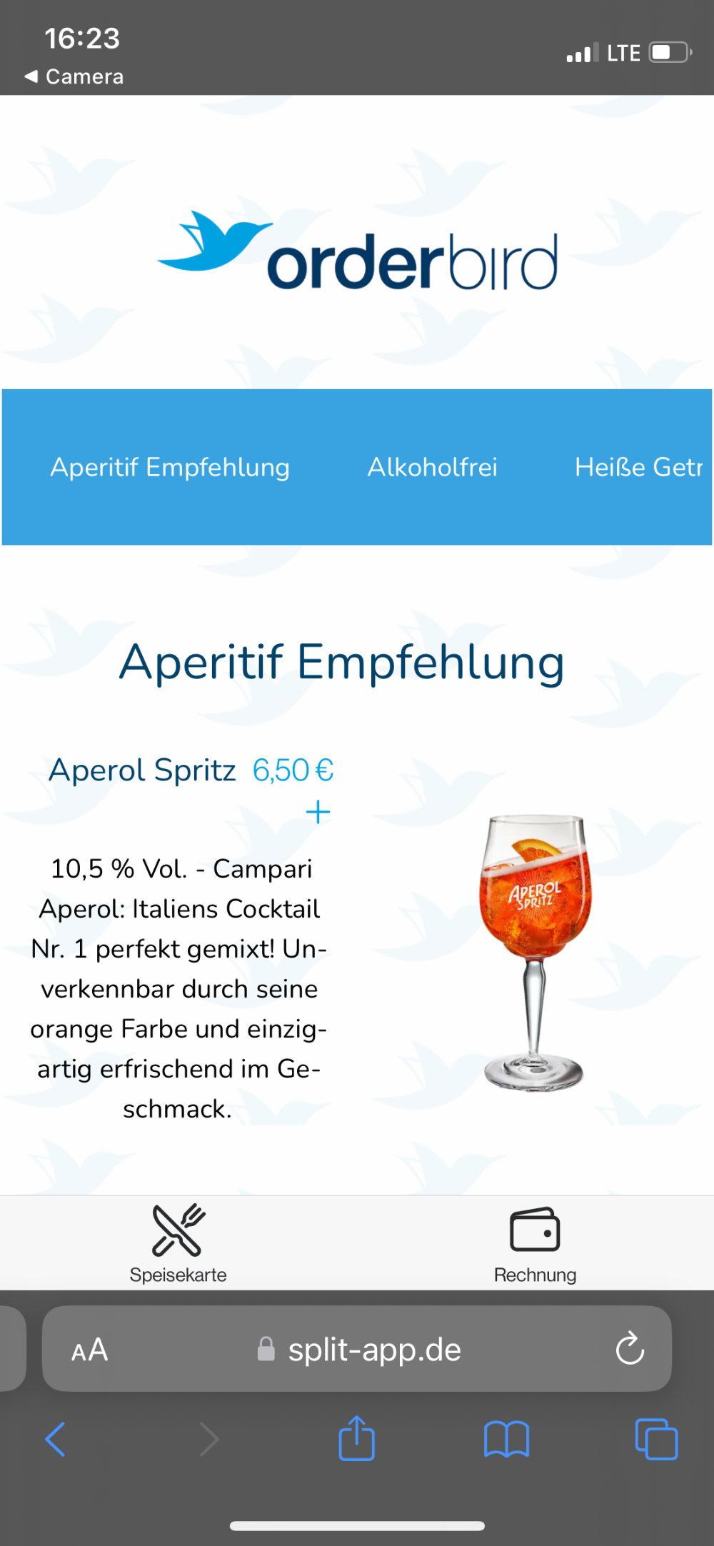
You have three layout options for your Digital Menu: Default, Kacheln, and Switch.
| Default | Kacheln | Switch | |
 |
 |
 |
|
| Best for: | All of them :)! Especially if neither the Kacheln nor the Switch layout provides satisfactory results. | Having a quick overview of available categories, divided into food and drinks. | Highlighting a small number of products with images. |
| Ideal When: |
|
|
|
Getting Started
- Open gastronom.split-app.de > Speisekartendesign.

- Click on "Layout" to switch between the three layout options:
- Choose the Default Layout if you frequently change categories and use few or no images.

- The Kacheln Layout is structured and clear, ideal if you have many product categories that do not change often. Categories are divided into “Essen” (Food) and “Getränke” (Drinks), which cannot be adjusted.
If category names disappear, check this guide: Warengruppen im Kachel-Layout sichtbar machen (available only in German).The Kacheln Layout: Best for Restaurants and Cafés
The Kacheln Layout presents menu items in a structured way. However, it is not suitable for businesses that do not serve food, such as bars, because the "Food" category is always displayed first and cannot be changed.

Tip for the Kacheln Layout: add icons to represent different product categories for better visual structure.Formatting Tips for Icons
For a visually appealing Digital Menu, consider these guidelines when creating icons for the Kacheln Layout:
White background, square format, positioned slightly below the center.
You can use this as a guideline:
- The Switch Layout is best for showcasing product images, especially if you have only a few categories.

- Choose the Default Layout if you frequently change categories and use few or no images.
- Try out different fonts or colors for the elements of your online menu. If you wish, upload a background image.
Tips & Tricks: Background Image
Your background image should have enough contrast with the text; otherwise, the menu will be difficult to read.
Even better: If you use a light background image, it should have very low opacity and dark text.
If you use a dark background image, the text should be in a light color.Finally, check how it looks in the Digital Menu: scan one of the QR codes from your table list.
- Click “Änderungen speichern" to update the design for your Digital Menu.
How Does It Look?
Before moving on to the next step, check how your changes look by scanning a QR code! Sometimes, text may become unreadable due to colors, or the category name may overlap with images.
This way, you can avoid results that turn out completely different from expected.